Note 2: If these gestures are implemented into an app, I would really like to be notified, credited, or at least contacted. Taking one's ideas and then selling them as your own for $50 is a really inconsiderate and greedy thing to do, and frankly, I would never want to work with you.
Introduction to the Market
 So we are at an interesting point in the technology sector right now; we're seeing tablet sales soar and the traditional desktop/laptop market shrink. Many argue this might lead to the "demise" of PCs or that people are just buying tablets as "secondary devices," but this isn't what I want to talk about. Far too many people get caught up in hypothetical analytics in where the market's going rather than discuss where they could take the market. That's what I'm going to talk about today.
Recently, Forrester surveyed almost 10,000 Fortune 500 employees on their tablet usage. Of the respondents, 32% said they desire to use a Windows 8 tablet at work, 26% said iPad, and a mere 12% listed Android. Once again, I'm not here to discuss what OS people hypothetically want; I'm here to think deeper about this. These hypothetical numbers are interesting but the real news comes in the form of the distribution of people currently using tablets in the workplace and how many want to. Only 21% of these workers said they use a tablet as a work device but 17% said they don't have a desire to use them. That implies that 83% of Fortune 500 employees want to use tablets in their daily workflow! So, why hasn't this panned out for them? I blame the lack of excellent Office-esque applications!
The Issue With Document-Based Apps
 Making a word processing app is hard. It's not hard in the traditional sense of development; it's hard because there are so many features and tablet UI's call for simplicity. How is it possible to make a clean, touch-based UI if you have to add buttons for tables, fonts, insertions, spell check, file operations, different views, citations, and much more? This is the question that has puzzled developers and designers for the last few years but that doesn't mean people haven't tried to fix it.
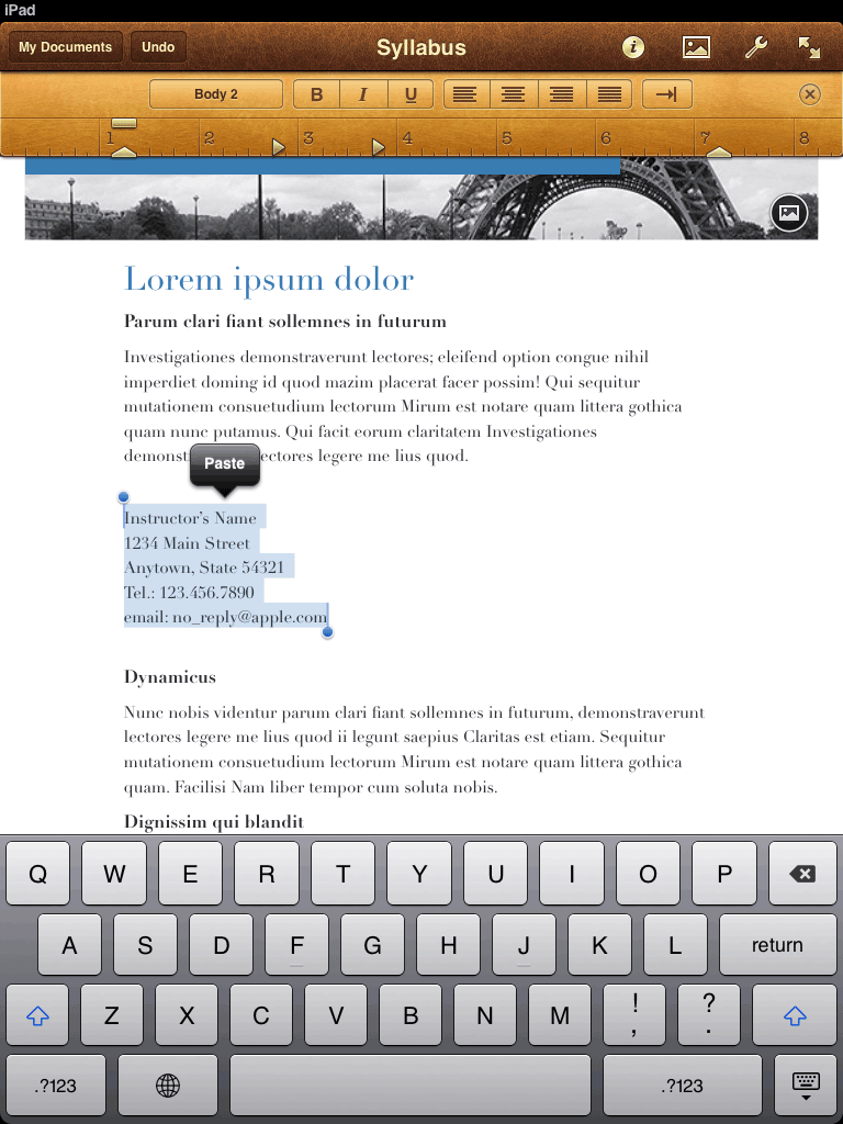
Enter Apple with Apple Pages. It's a very attractive app that offers many powerful features, but it's mainly a desktop application. Notice that the UI elements are tiny which means users have to hunt for certain buttons and aim precisely which is a paradigm that's only useful for a cursor. If people were typing a paragraph and then had to bold a word, the workflow would be:
Type > Look up > Hold finger over certain word > Hit "Select" > Find Bold button > Press it
As you can imagine, this is a terrible experience for people who just want to pump out documents quickly. If your workflow has to involve the user hunting, aiming, and moving their arm around a 9 inch screen, then you're obviously not doing it correctly.
Next, we should look at Microsoft's attempt: Office 2013. Office 2013 is an interesting beast because it attempts to addMetro- err- the New Windows UI design to the entire suite of tools while still retaining all of the functionality users know and love. How exactly did Microsoft tailor Office for touch screens, then? Well, they really didn't.
 As you can see, the UI elements in the app are legitimately the same (or nearly the same) as a desktop application. They've altered the fonts and spacing to be more "tablet-friendly" but that's really the only differences that shine through. While the Ribbon UI supposedly works well (I have my gripes but that doesn't belong in the scope of this post), it doesn't actually translate well to a finger-based input system. To insert a photo, the user would have to lift their head to the top bar, hunt for the "INSERT" header, tap it with immense precision (it's just one word...), hunt for the now-visible "Photo" button and finally tap it. Once again, this is not an ideal workflow; it's time-consuming and ultimately confusing.
So, after looking at these apps created by these computer juggernauts, I hope you could see why tablets aren't popular for document creation. Beyond the UI of the apps, there's the notion that users will presumably carry around an external keyboard rather than using the on-screen keyboard which is a problem in and of itself. So, what can we do about this?
Next, we should look at Microsoft's attempt: Office 2013. Office 2013 is an interesting beast because it attempts to add
So, after looking at these apps created by these computer juggernauts, I hope you could see why tablets aren't popular for document creation. Beyond the UI of the apps, there's the notion that users will presumably carry around an external keyboard rather than using the on-screen keyboard which is a problem in and of itself. So, what can we do about this?
Anyone Can Point Out an Issue; The Greats Propose Solutions
Gestures! Say it with me: gestures! Y'know, there's something to be said about the two biggest proponents for gestures not implementing them into their word processing apps. (Apple pushed two-finger scrolling, pinch to zoom, swipes, etc. and Microsoft's Windows 8 is basically all gesture-based).
In the modern age of application design, gesture-based input is the holy grail of UI implementation. If done correctly (ex: pinch-to-zoom), the gestures will feel intuitive and easy to understand. Though, if done incorrectly (ex: Google dividing the status bar in Android into two invisible sections that respond differently upon a swipe down), the user might be confused and annoyed when trying to do them. This leads the user to dislike the UI and, most tragically, not use a certain feature or app entirely. Knowing this, it's extremely important to "get it right" so the UI is intuitive enough for the user to understand the gestures and be quick enough that the user's workflow is fluid.
Now, I don't have all of the solutions; heck, I don't even have a tenth. Though, I do have ideas on how the UI should work! Here are some of my ideas and a few mockups/examples:
Text Input
Obviously, the on-screen keyboard will have to be used. This is fine to a certain extent, but it can be vastly improved. Going off iOS, the workflow of selecting text is a mess. The user types what they want but then have to move their finger to where they want, press-and-hold over the word they want, release, wait for the pop up, hit select, and then finally move the second cursor over the scope of their selection. We can do better.
Looking at an iOS jailbreak tweak named SwipeSelection, it's easy to see how simple text selection could be. To move the cursor, the user just swipes left or right on the keyboard. It just works. Now, my proposal to improve this would be to include a better way to select text. One finger swipe moves the cursor but two fingers could be used for both cursors. So, the user finds where they want to move the cursor to with their right hand and then they use their left index finger to move the (now-visible) left-hand cursor. This turns the workflow of text selection to the user types, swipes their right index finger on the keyboard (essentially not moving far), and then the left index finger swipes left or right. That saves a lot of time and is pretty intuitive! Now that that's worked out, lets move on to what one does after selecting text.
Font Operations
Once the text is selected, there are only a finite amount of operations the user would like to do. These include font size alterations, font color, bold/underline/italicize/strikethrough, highlight, make a link, and delete. The delete function is obvious here, but let's try and tackle the other features.
 To solve the font color operation, we rely on a simple press-and-hold gesture on the typing area after selecting text. This would then bring up a color wheel around the finger where they user can just swipe over the color they'd like (a la Android Jelly Bean's unlock gesture). I've created a quick mockup (please ignore the absence of "selected text") which you can see here. This turns a hunt-and-aim workflow into a simple tap-and-hold followed by a swipe. It really couldn't be simpler, in my opinion.
Great, now let's work on font size. This is simple and intuitive; once the text is selected, the user should be able to pinch in or out on the text area (like above) and the font would be altered based on that. I don't really think I need to go into too much explanation here.
 Next, we should try to create a quick and intuitive way to implement bold/underline/strikethrough. This is tricky because these operations have never manifested themselves as more than just a group of buttons. So, going with the paradigm we've created above, we could devote the left screen to a similar gesture as font color. This means tapping and holding the right side of the text area would yield the color ring whereas the left-hand side would yield another ring; the attribute ring. (Name can obviously be improved). It's the same concept, just with less intuitive options which yield an initial minor hunting game. Theoretically, this ring could also hold the hyperlink and highlighting operations. Since these two rings are extremely similar, it's easy to see that users could grasp one easily which would improve their chances of grasping the other!
Menu Systems
The next challenge is the menu system. As seen in Office 2013, compartmentalizing the location of similar operations is extremely useful! Though, Microsoft seemed to use the desktop system of menu selection and even used a form of Ribbon UI, which is found in Explorer and older versions of Office. Basically, they didn't do much in the way of tablet-izing their menus. Here's how we can change that.
Suppose there was a menubar-typed line of text similar to how Microsoft does it (I really like the capitalized categories). This bar would have compartmentalized categories based on types of operations; file operations, text edit operations, insertion operations, table operations, etc. The bar would be located above the keyboard (or alternatively on the top but that would make the user move their hands more). This would look like this:

Now, here's the interesting part; you don't just click on the label you want and have new options appear somewhere (Ribbon UI...), the menu is gesture-based! The user could press-and-hold on a certain menu item and a list of options would expand upwards and downwards. Also, the faint blue glow would appear on the bar where the operation was selected. Now, the user just moves their finger up or down which would cycle through the list until the option they wanted was in the blue center. Once done, they release their finger to select said operation. I know this is slightly confusing to read, so take a look at this:


Font Operations
Once the text is selected, there are only a finite amount of operations the user would like to do. These include font size alterations, font color, bold/underline/italicize/strikethrough, highlight, make a link, and delete. The delete function is obvious here, but let's try and tackle the other features.

Great, now let's work on font size. This is simple and intuitive; once the text is selected, the user should be able to pinch in or out on the text area (like above) and the font would be altered based on that. I don't really think I need to go into too much explanation here.
 Next, we should try to create a quick and intuitive way to implement bold/underline/strikethrough. This is tricky because these operations have never manifested themselves as more than just a group of buttons. So, going with the paradigm we've created above, we could devote the left screen to a similar gesture as font color. This means tapping and holding the right side of the text area would yield the color ring whereas the left-hand side would yield another ring; the attribute ring. (Name can obviously be improved). It's the same concept, just with less intuitive options which yield an initial minor hunting game. Theoretically, this ring could also hold the hyperlink and highlighting operations. Since these two rings are extremely similar, it's easy to see that users could grasp one easily which would improve their chances of grasping the other!
Menu Systems
The next challenge is the menu system. As seen in Office 2013, compartmentalizing the location of similar operations is extremely useful! Though, Microsoft seemed to use the desktop system of menu selection and even used a form of Ribbon UI, which is found in Explorer and older versions of Office. Basically, they didn't do much in the way of tablet-izing their menus. Here's how we can change that.
Suppose there was a menubar-typed line of text similar to how Microsoft does it (I really like the capitalized categories). This bar would have compartmentalized categories based on types of operations; file operations, text edit operations, insertion operations, table operations, etc. The bar would be located above the keyboard (or alternatively on the top but that would make the user move their hands more). This would look like this:

Now, here's the interesting part; you don't just click on the label you want and have new options appear somewhere (Ribbon UI...), the menu is gesture-based! The user could press-and-hold on a certain menu item and a list of options would expand upwards and downwards. Also, the faint blue glow would appear on the bar where the operation was selected. Now, the user just moves their finger up or down which would cycle through the list until the option they wanted was in the blue center. Once done, they release their finger to select said operation. I know this is slightly confusing to read, so take a look at this:

Once the user opens the secondary menu, they slide their finger downwards to move "Photo" into the blue area and then they release their finger.

From a usability standpoint, I believe this is great! If you think about it, the selection box (the blue area) would read "INSERT" and then "PHOTO." This is perfect for easily explaining what exactly is occurring. Also, it would be a quick gesture that everyone knows (press-and-hold and slide up or down). On top that, the entire menu could be customizable so the user could move the categories into the position they'd like so the UI would be less hunting-based and more based on personal preferences. All in all, this would reduce the workflow from "move hand to top of screen, look for category, click category, look for option, move hand, click option" to "look for category, press-and-hold category, slide finger up, release finger." Much better, IMO.
No comments:
Post a Comment